Concept case study · Fintech SaaS
Business banking that feels calm, not complicated.

Halden is a concept for a business banking and spend platform for startup finance teams. Accounts, cards, bills, approvals and payments in one product, designed end to end: research, user flows, wireframes, design system, high-fidelity UI and a working prototype.


Designer
Abdullah Al Akhzar · product design, UX, prototyping
Deliverables
Flows, wireframes, UI, design system, prototype
Platform
Responsive web, light and dark
Type
Self-initiated concept
app.halden.com · Home
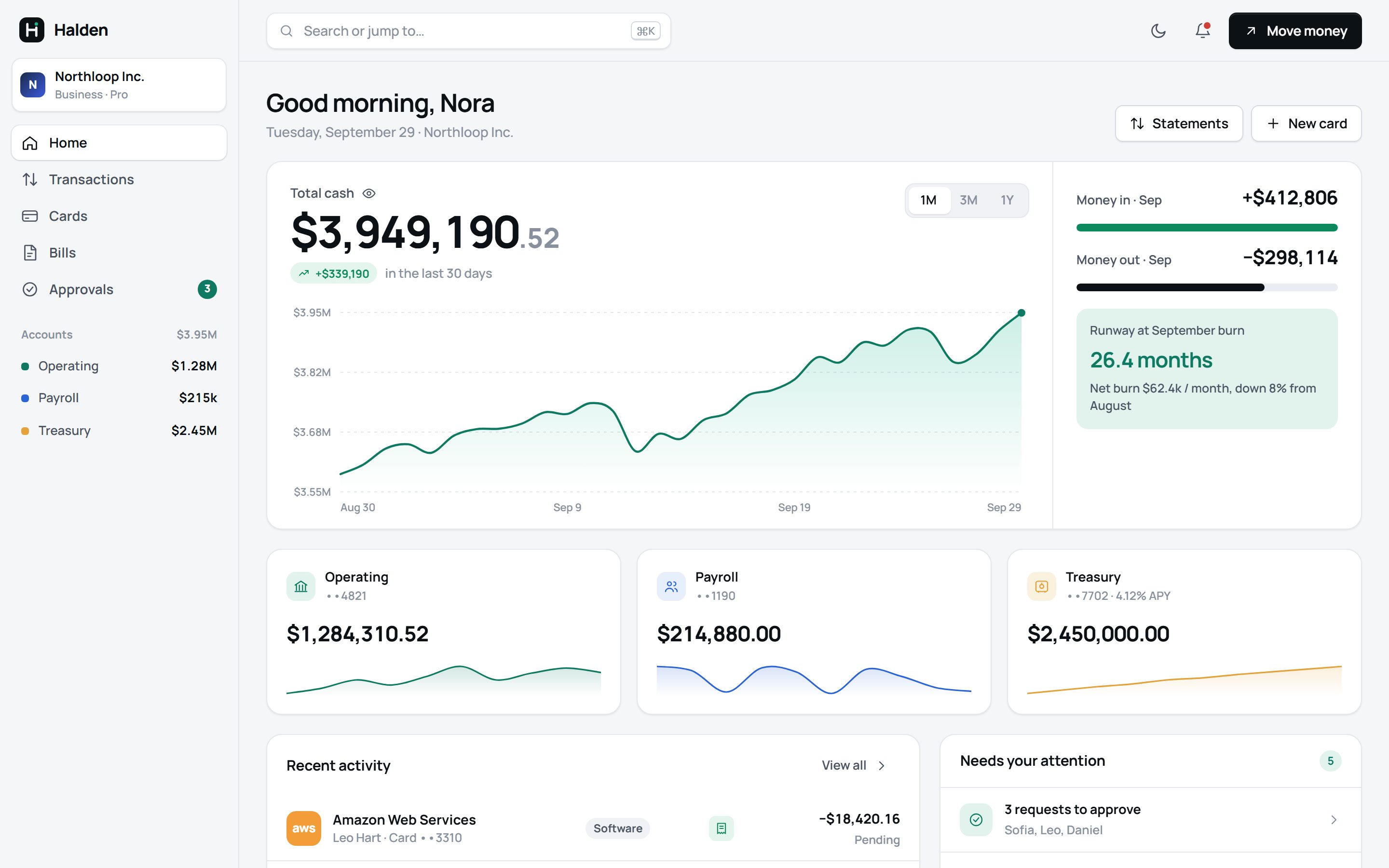
Halden dashboard in light mode showing total cash, a 30-day balance chart, accounts and recent activity
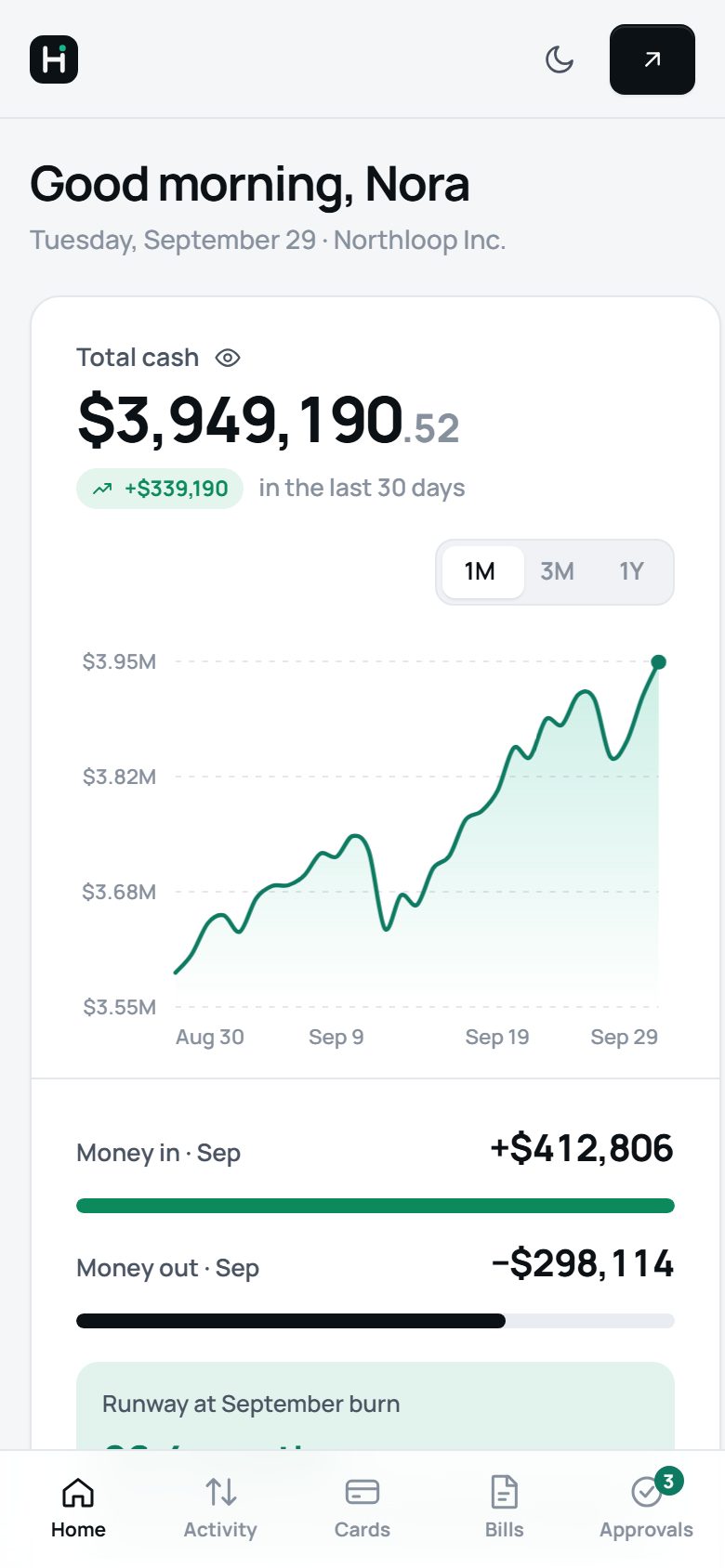
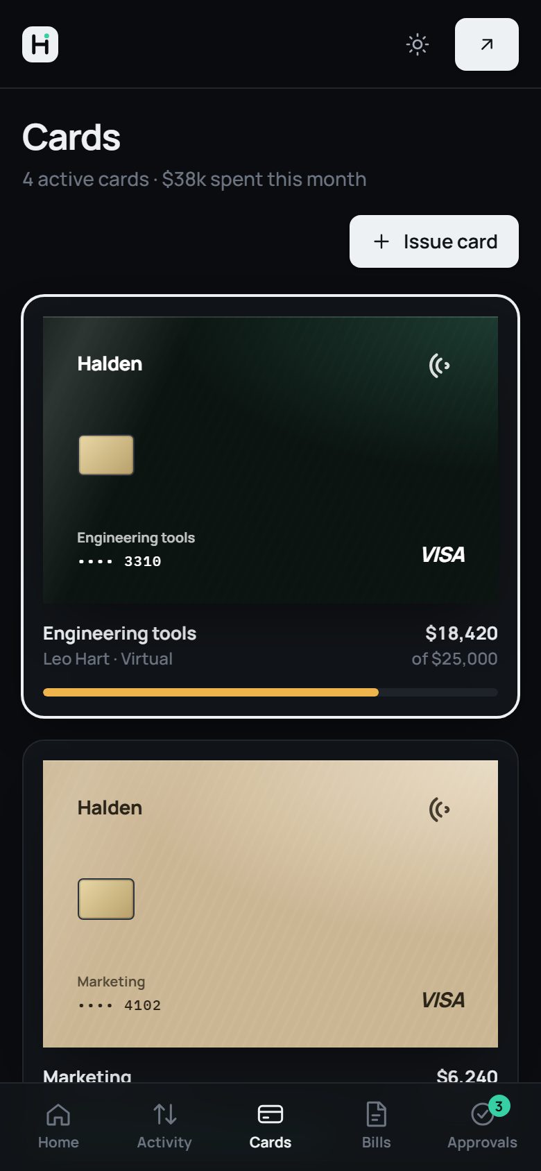
Halden home screen on mobile
The problem

Finance teams live in five tabs

A 40-person startup usually runs its money across a bank portal, a card provider, a bill-pay tool, an approvals thread in Slack and a spreadsheet that ties them together. Each tool is fine alone. The work happens in the gaps between them.

Month-end takes days

Missing receipts and uncategorized card spend pile up until close, when someone chases 30 people for screenshots.

Approvals lack context

A “can you approve this?” message arrives without the budget, the policy or the purchase order it relates to.

Nobody sees runway live

Cash position is rebuilt by hand each week, so founders make hiring calls on last month’s numbers.

Who it’s for

Three people, one source of truth

I designed around three roles with different jobs. The same data shows up for each of them, framed for the decision they need to make.

Nora, Head of FinanceOwns cash, close and controls

“Show me what needs my decision, and let me make it in one step.”

  • Approves bills and limit changes daily
  • Closes the books monthly
  • Reports runway to the CEO
Leo, Engineering leadSpends against a team budget

“I just want to pay for AWS without filling in a form.”

  • Holds a virtual card for software
  • Needs limit increases when usage spikes
  • Forgets receipts
Daniel, OperationsBuys parts from suppliers

“Get this supplier paid before the line stops.”

  • Submits invoices and purchase orders
  • Pays international vendors
  • Tracks what has shipped
Design principles

What “premium” meant in practice

“Premium” can drift into decoration. These three rules settled design arguments and kept every screen focused on money and decisions.

Calm by default

One accent colour, generous space, and numbers set large. Alerts appear only when there’s something to do.

e.g. semantic colours never compete with the accent

Every dollar explained

Any amount opens to its source: receipt, card, person, policy and approval trail. Nothing is a dead end.

e.g. transaction drawer, bill approval timeline

Act where you look

Decisions happen in place, with instant feedback and an undo. No separate pages just to approve something.

e.g. inline approvals, card freeze with undo
Process

From map to working product

Each step produced something the next one built on. Click through to see the artefacts.

Key screens

Decisions behind the screens

Every screen below is a real state in the prototype. Open it to click through the same flows.

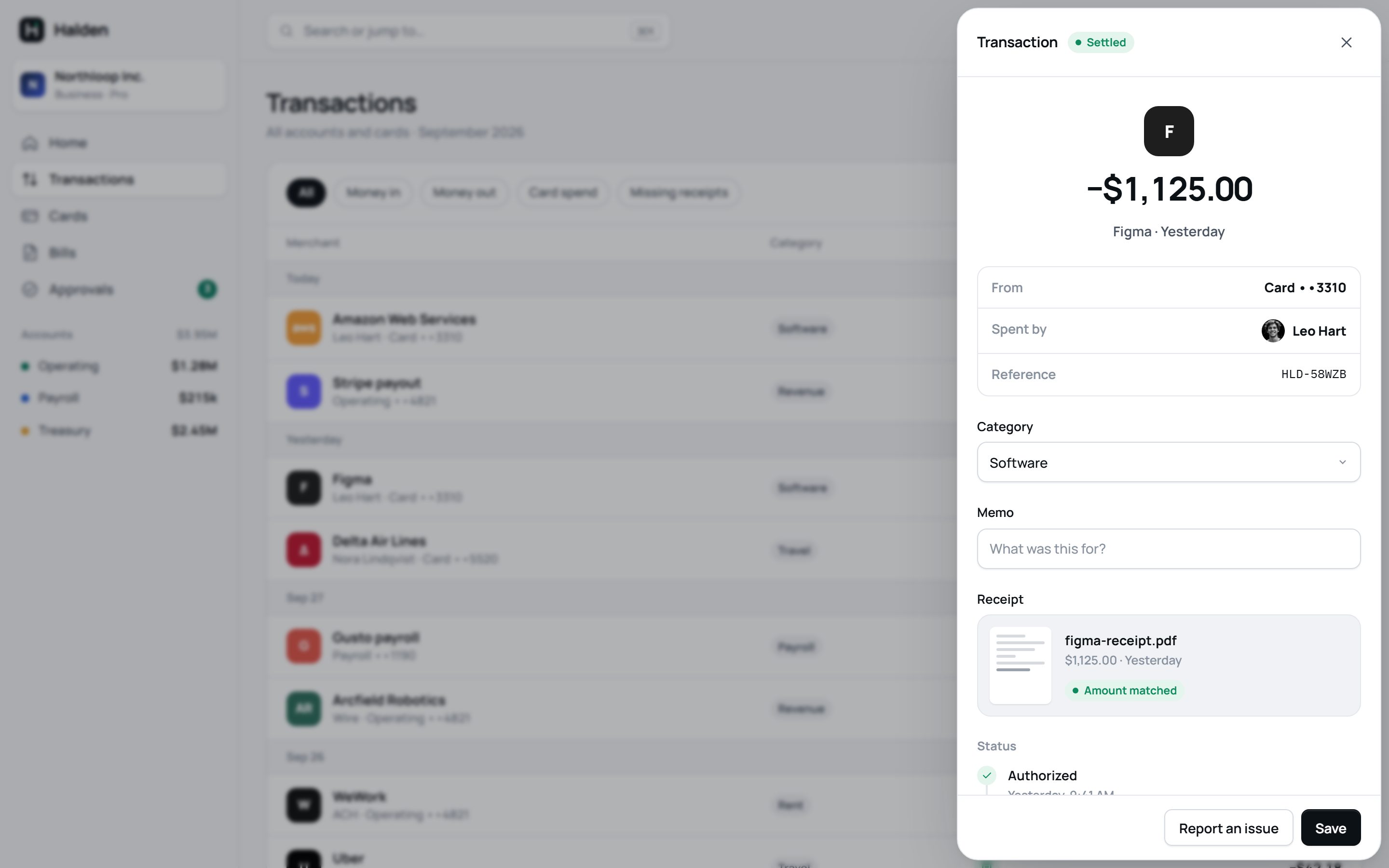
Transaction drawer with receipt matched automatically
Transactions

Month-end work, done in the moment

Opening a transaction shows who spent it, where it came from and what’s missing. Dropping in a receipt triggers a scan, then confirms the amount matches.

  • Drawer, not page. The list stays visible, so reviewing 20 transactions keeps its rhythm.
  • Missing receipts are a filter. The home screen links straight to them.
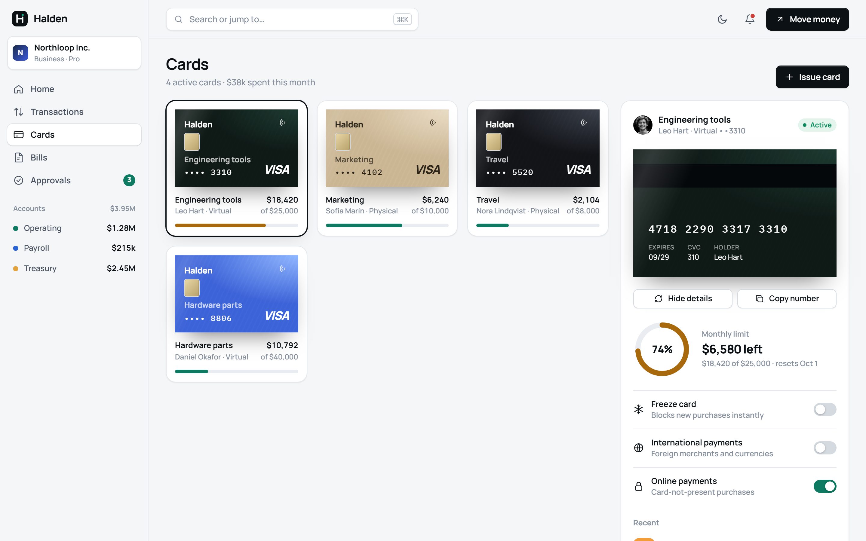
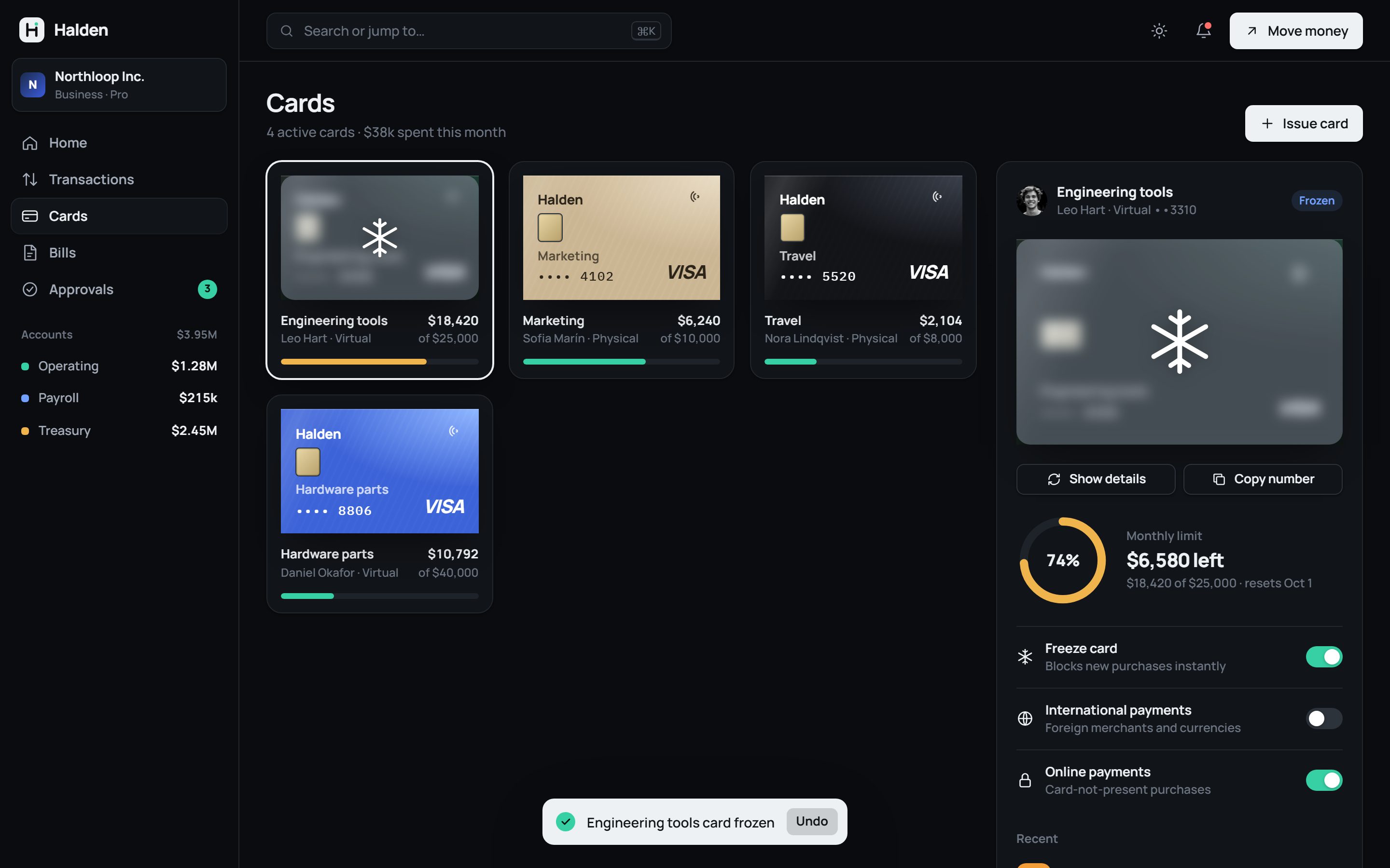
Card management with limit ring and card details revealed
Cards

Controls people can trust at a glance

Each card shows spend against its limit before you open it. Card details flip into view on request, and freezing is one switch with an undo.

  • Warning colour at 70% of limit, before it becomes a declined payment.
  • Frozen state is visual. The card frosts over everywhere it appears, not just in a badge.
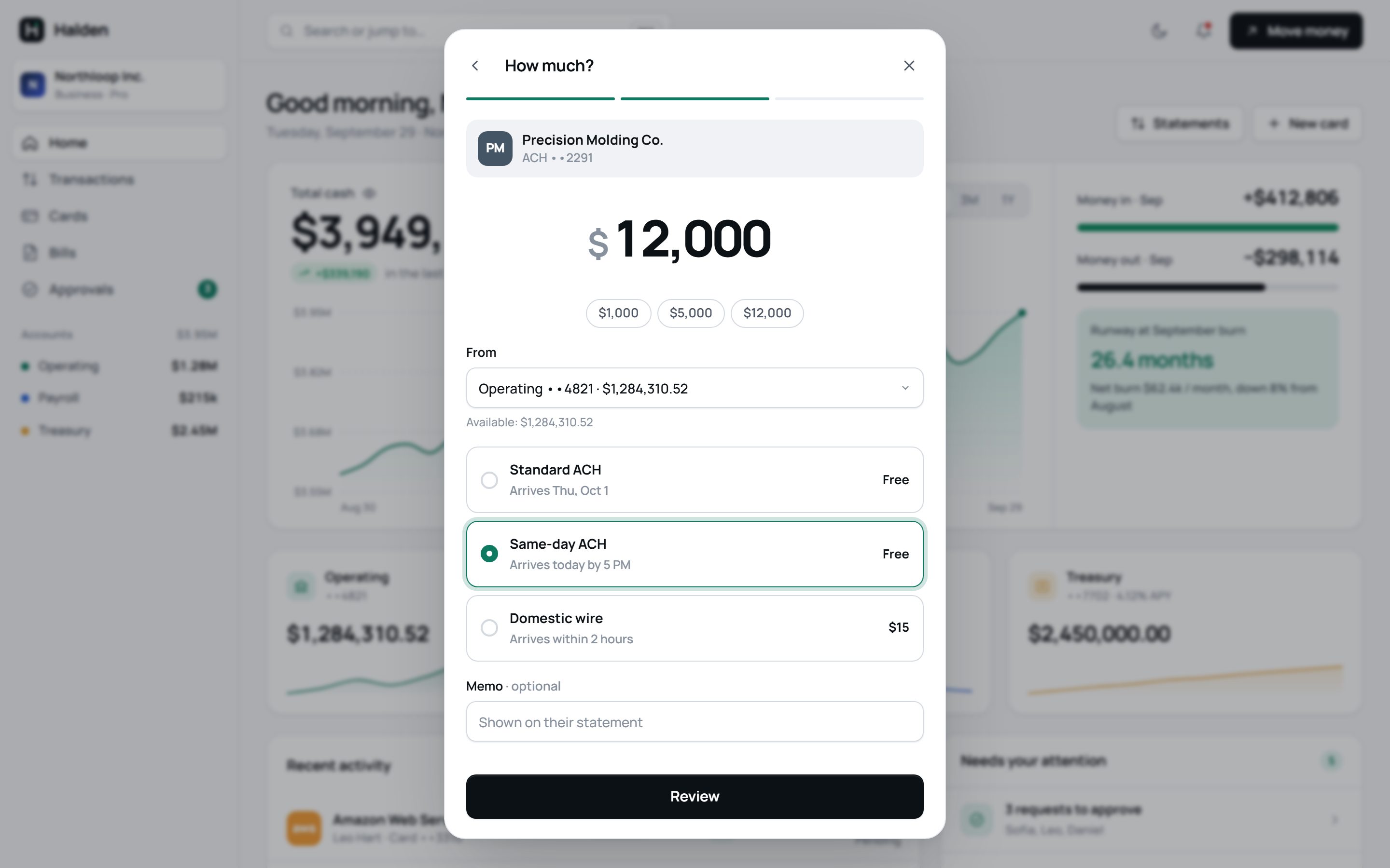
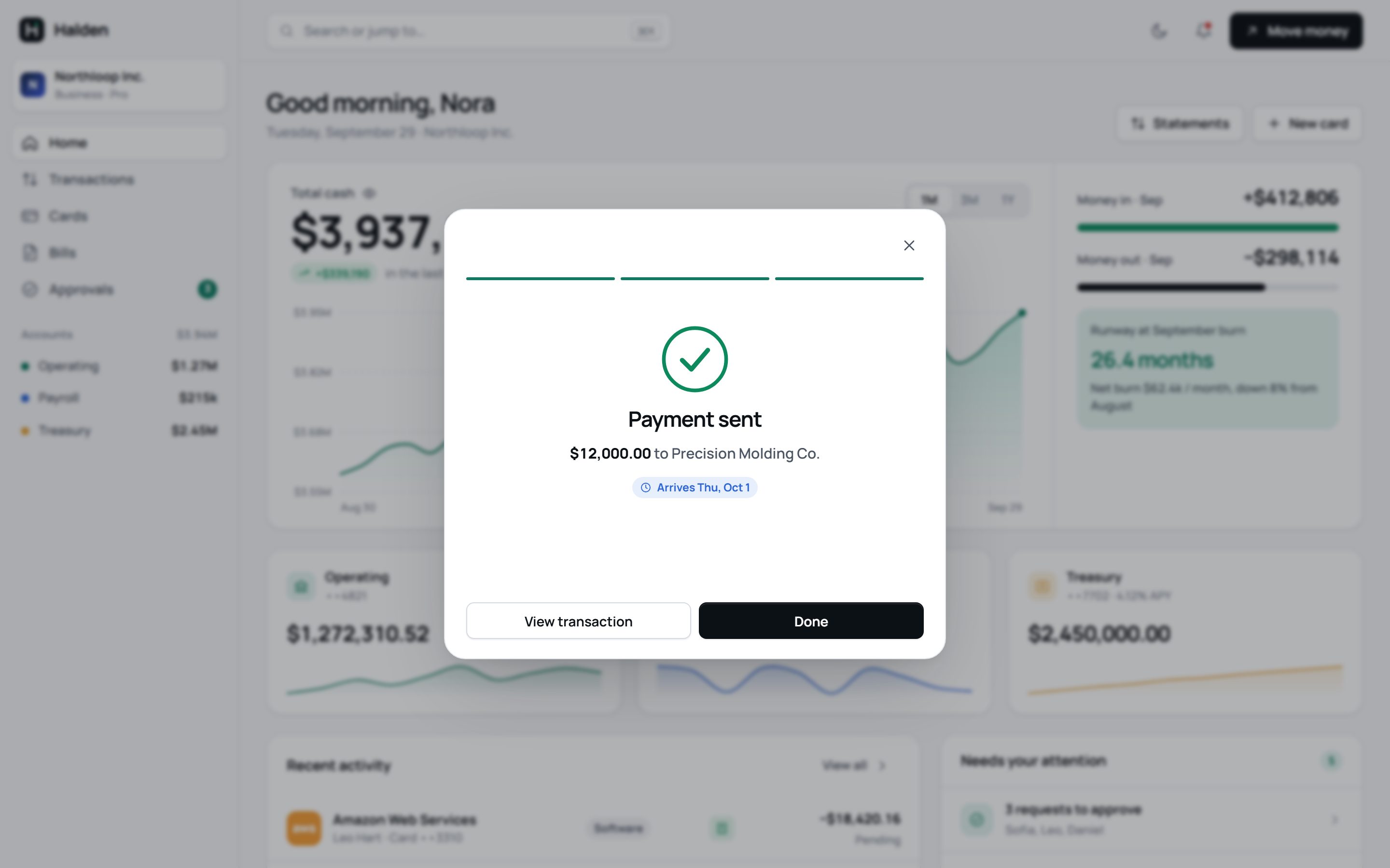
Send money: amount and speed stepSend money: payment sent confirmation
Move money

A payment in three calm steps

Recipient, amount, review. Speed and fees are shown as choices with arrival dates, not jargon. Limits are checked before the review screen, so errors never arrive at the last step.

  • The approval rule is stated up front: “Under your $50,000 single-approver limit.”
  • Balances update live behind the success screen, so the result is visible, not just announced.
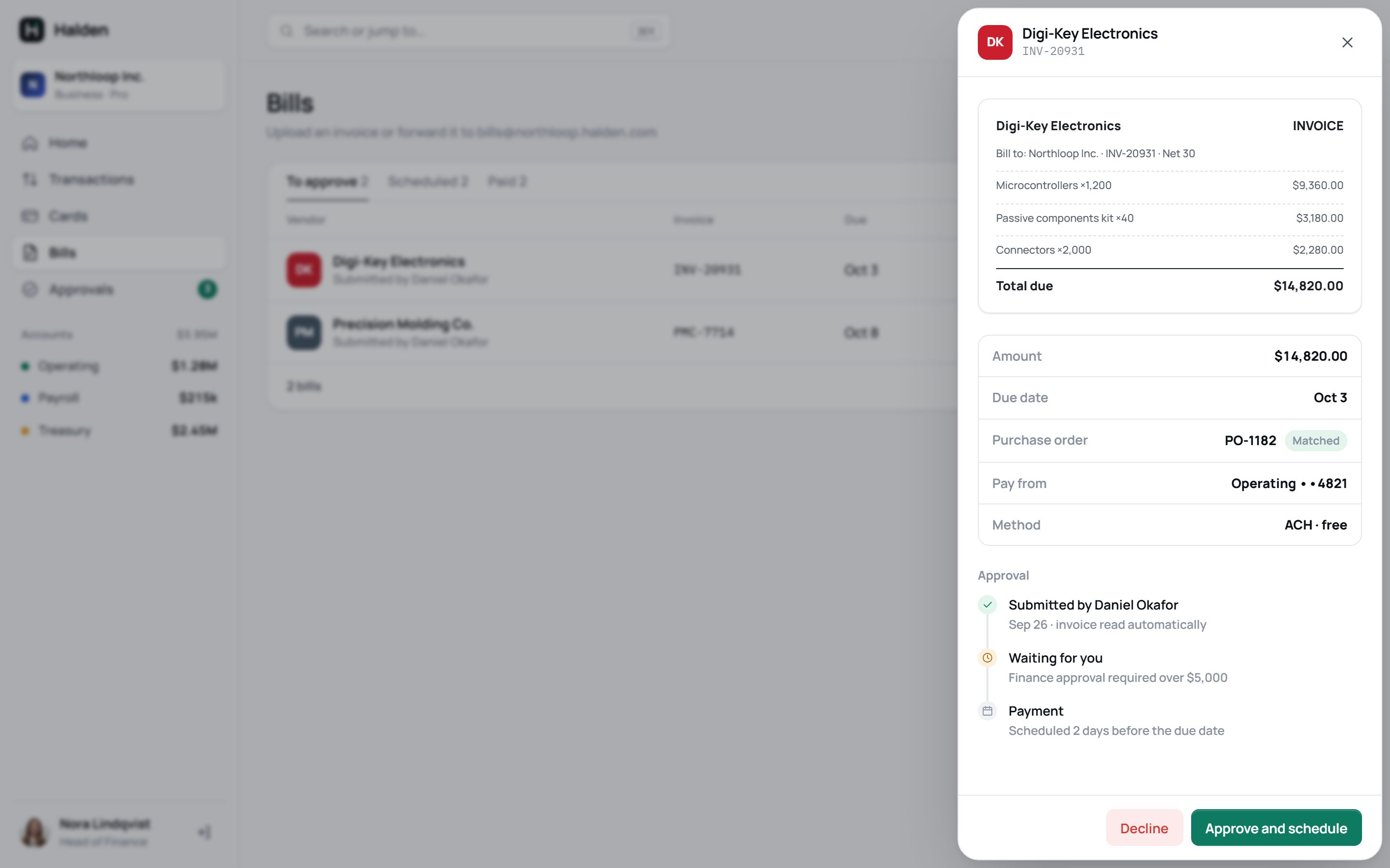
Bill detail with invoice, PO match and approval timeline
Bills

Approvals with the context attached

An invoice arrives with its line items read, its purchase order matched and the approval path shown. Approving schedules the payment two days before it’s due.

  • Policy checks in plain words: “Matches PO-1182 and the goods receipt.”
  • Decline is a real option, not buried in a menu.
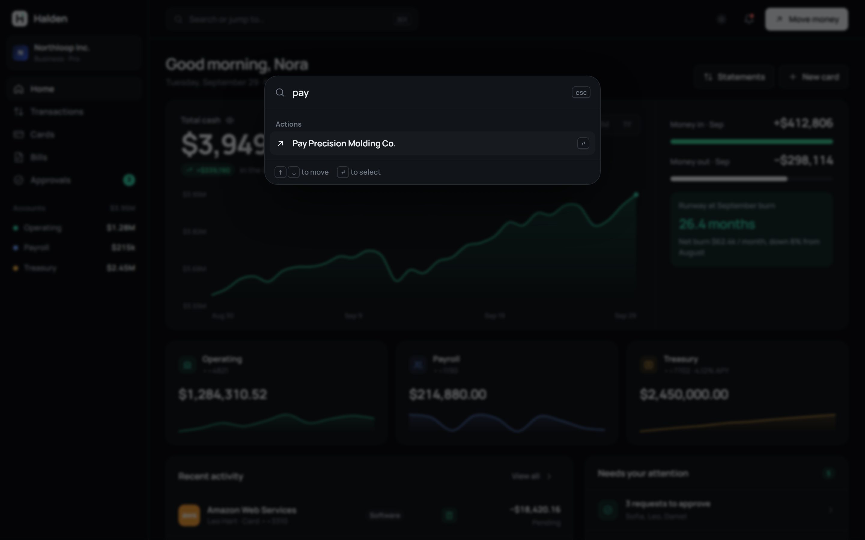
Command menu in dark modeFrozen card in dark mode
Dark mode + keyboard

Built for people who live in it

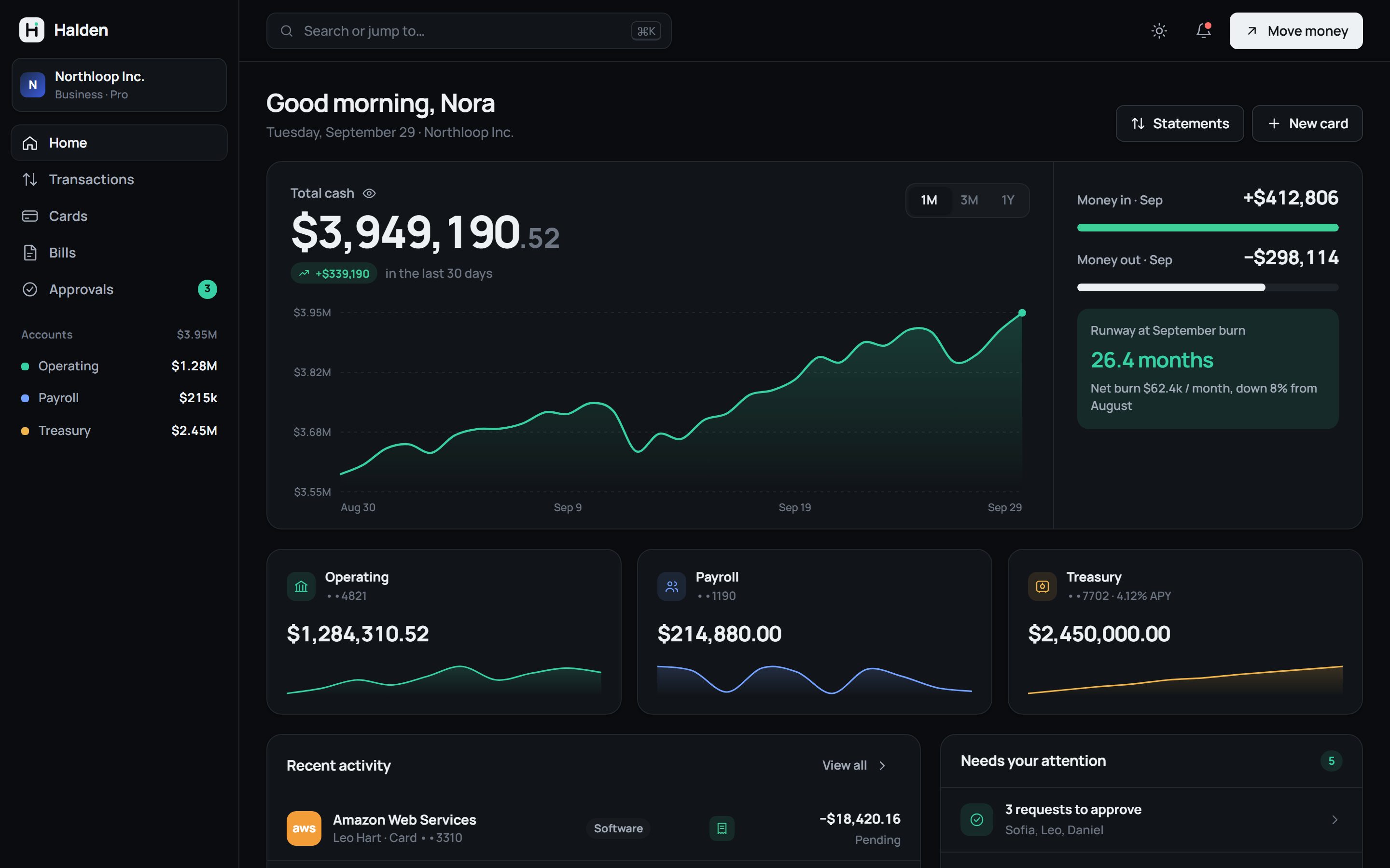
A full dark theme comes from the same tokens, not a filter. Power users get a command menu (⌘K) that can jump anywhere or start any action.

Mobile homeMobile cards in dark mode
Responsive

The same product in your pocket

The sidebar becomes a tab bar with an approvals badge. Tables collapse to the two columns that matter: who and how much.

Motion

Micro-interactions, live

Motion confirms that something happened and where it went. Every animation uses the system’s three durations and two easing curves. Try them.

Halden
•••• 3310VISA
Freeze a cardFrost and snowflake settle with a spring, so the state reads instantly.--motion-slow · --ease-spring
$3,949,190.52
Balance count-upNumbers ease into place on load and after a payment, so change is visible.1100ms · ease-out quart
$412.60
$10,000
Approve in placeThe request slides out, the badge count drops, and a toast offers undo.--motion-slow · translateX + collapse
Loading to successButtons hold their width while loading, so nothing on the page jumps..btn.is-loading · spinner
Handoff

Designed to be built

The system is written as design tokens and components developers can use directly, with every state defined.

/* tokens.css (excerpt) */ :root { --accent: #0d7a61; --pos: #0c8a5d; --neg: #cf3f3a; --radius-lg: 16px; --motion-slow: 360ms; --ease-spring: cubic-bezier(.34,1.4,.64,1); } :root[data-theme="dark"] { --accent: #37cfa4; /* same names, new values */ } <!-- a component is just classes + tokens --> <button class="btn btn-accent is-loading">Send</button>
  • One set of names, two themesDark mode swaps token values. Components never reference a raw colour.
  • States are part of the specHover, focus, disabled, loading, error and empty are designed for each component.
  • Accessible by defaultVisible focus rings, full keyboard navigation, labelled controls and a reduced-motion mode.
  • Ready to move into FigmaTokens map one-to-one to Figma variables. Every screen is also live code, which removes the redline step.